Article Format Smashing Right on a Target – What is It?
2015.07.16
 (5 votes, average: 5.00 out of 5)
Models of elements arrangement on a site
We all used to think that people traditionally read information from left to right. However, on the Internet due to the common trend of reading, the situation is different: site content is placed in the most visible places to focus the user’s attention. In this regard, there are 3 specific models of info placing: Gutenberg’s, Z-shaped and F-shaped.
- Gutenberg’s diagram.

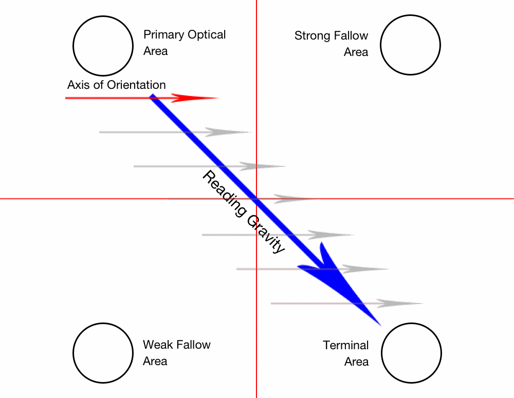
This model describes the eye movement when viewing information. The main visual area is in the page upper left corner; then user’s attention moves down, passing a center of a screen; and the final visual area is in the lower right corner. This diagram consists of four areas:- Initial (upper left page corner).
- Final (lower right corner).
- Upper right with a great potential.
- Bottom left part with a low potential.
Gutenberg’s diagram is best fit for sites with lots of content.
- Z-shaped pattern.
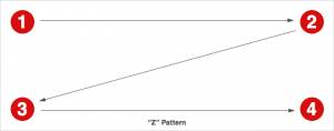
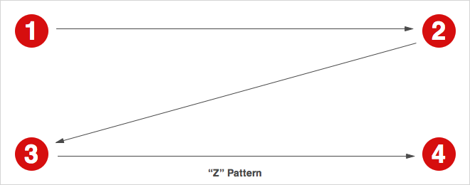
Eye movement begins from the upper left, going horizontally to the right, then drops to lower left part of a page, once again going horizontally to the right. This model is more efficient than the Gutenberg’s diagram. User’s eye passes through the page center, but this model includes more than two coordinates that were missed in the Guttenberg’s chart. - F-shaped pattern
A familiar to web designer’s model. According to F-shaped model, users scan the contents of the site horizontally. Eyes rushes from the left to the right page side.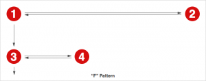 Frequent repetition of Z- and F-shaped patterns weakens users’ attention. In the end, they prefer to glance vertically on the left page side. This implies web designers to create additional centers that attract attention.Talking about these models, we need to understand that they describe the natural movement of the human eye. You can apply these models in practice to solve the problem of poorly designed pages, as well as good web designer should not forget about these rules and the ability to apply them in his work.

Proper website content layout: rules that should be followed
- Pay attention to details. Oddly enough, but site structure and design elements details and nuances provide its success among the visitors. Combination of various elements helps to create a golden mix that causes the WOW effect and positive emotions. A large amount of info, sophisticated design and long load times repel visitors.
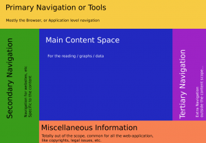
- Site navigation menu. Site navigation should be as simple and understandable as possible. The most common mistake is a glut of top-level navigation with a huge amount of points: this complicates the perception of information and orienting through a site. Use 5 or less navigation points at the first navigation level. Need more? Think about whether you can group some of them within the meaning and arrange further details on the 2nd and 3rd level of navigation.
- Headlines. As there are kilotons of info in the Internet, users become accustomed to quickly scan a site for the presence of relevant content. Use headlines and share content by its meaning to help visitors find target info quickly.
- Text. It is no secret that reading from the screen is much harder than from the paper. Simplify the process of getting your visitors to the textual info. Avoid writing large blocks of text and dilute them with relevant images and photos. If you are using a template with a wide content area, place the text in “Columns” module to make it look nice and neat.
- Pictures. Consider images and pictures format when placing them on a page to get the most beneficial look.
- Columns. Use them to arrange content organization on a site, not forgetting about the visual harmony. E.g., loaded images should be of the same size, text should contain an equal number of rows.
- Sidebar and footer. These are two unchangeable panels, visible on every page. Use it for placing of info that you need to show constantly to your visitors (e.g., contacts, subscription, social networks buttons).

Where is the best place to put the ad?
- Consider users needs. Think about:Why do visitors come to your site?
- What exactly are they looking for on the page where ads will be placed?
- On what visitors’ attention will be focused?
- How to make ad visible, but not annoying?
- How to make page attractive, clean and not overloaded with information?
Choose advertisements that are easy for understanding.
- Present content to the best advantage.
 Place ads next to the target content. Think about whether your visitors can easily find relevant information. If your site has materials that can be downloaded, place links to them at the page top. Check whether your ads are at the page top when using all browsers.
 - Clearly highlight the ad. Do not present content in the same colors as ad or ads.
- Label ad blocks and do not place them directly under the page title not to deceive your visitors. Do not post advertisements where they can be confused with menu items, navigation buttons or links to download.
- Less is better. While you can place up to several ad units, make sure users can get easy access to what they need, not entangled among advertising.
- Check your site. Take a moment and try to look at your website through the eyes of new visitors. If you create a web recourse, based on templates, carefully check whether the ads displayed correctly. Ask yourself, whether it’s easy to find content and distinguish it from ads. If all answers are affirmative, then you’ve done everything right.
The basics of article formatting with CSS
To prepare article layout using CSS is quite easy, notwithstanding it first seems harder than by using tables.
Look at the every part of your page as at a separate fragment that you can move and transform at will. These fragments can be placed either absolutely or relatively.
- “Option” – describes an element, when it is positioned absolutely (“absolute”), relatively (“relative”) or static (“fixed).
- “Static” – the default option for all elements, which defines their normal layout, like in HTML document.
- “Relative” – similar to static, but you can move items from its former location.
- “Absolute”. Transforms element from HTML-document to a new one that can be positioned in any part of the page.
- “Fixed”. The same as “Absolute”, but the element is positioned in relation to the browser window, not to the page. As a result, element positioned with the help of “Fixed” always stays in the same place, even if you scroll the window in the browser.
- “Floating” – used for positioning of small page elements, but you can also use it to large fragments, such as navigation columns.
CSS is a modern solution – it gives you the pages of the less weight.
Articles layout: how to ensure content readability
The effectiveness of publications depends on the materials readability. Easier to read content directly affects the decision of the audience whether to read it or not.
How to stimulate the reader to scroll down the page?
Opening a Web page, you see only small piece of the content. To view the entire part, you have to scroll. The audience lives in conditions of information overload, so many of visitors are too lazy to scroll. Publish the most important content at the page top. Sure, it is not always technically possible: an alternative decision is to put the simplest content at the upper part of a page, gradually increasing its complexity to the down (NOTE! we’re talking not about sense, but visual complexity).
- Make headlines contrast, using serif fonts.
- Increase line spacing. Standard line spacing for web pages is 1.15. To increase readability, try to increase the line spacing. The optimal interval is the value of font + 6-8 points. If you are using 12 font, the interval size should be 1.18 – 1.20. Too much line spacing makes it difficult to read.
How to display price-lists?
Customers almost always considered the price of the goods or services as too high, regardless to the real situation. The following guidelines will help you smooth out the edges and gently present your price-list to visitors:
- Visually highlight the benefits, do not focus on the numbers.
- Use the most expensive product as a scarecrow. It’s the most suitable recommendation for business that sells services. Develop a product that is much more expensive than your proposals. Use it as a scarecrow against which prices of other products seem acceptable.
- Post price-list in descending order if you bet on the sale of the most expensive products.
- Propose a middle ground to costumers. Many buyers choose not too expensive and not too cheap product, therefore it’s necessary to outline such proposals. Cross out options, not available for buyer if he chooses cheaper product.
- Make a free offer inconspicuous.
Text align
The best way in 99% of cases is to align text to the left, as it makes it easier to read. If the text is centered, people have troubles when transiting from line to line. Centering can be used for headlines or short slogans.
White text on a black background
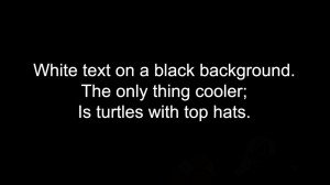
Black text on a white background is considered to be the optimal solution of articles format. But white text on a black background has advantages in some cases. Site visitors either read or scan the text. E.g., when you offer users a long article, they read it (or close the page). Dark background with white text works well when it comes to titles and labels on the elements of navigation. It encourages users not to read, but to scan the label. This process happens quickly, so the visitor does not have time to feel the inconvenience.
How to make your homepage easier to grasp?

- Do not tell visitors “Welcome”. In the era of information boom you do not have time for an obsessive courtesy. Instead of this, show visitors a product benefits.
- Avoid stock photos (better use self-created graphics).
- Do not place long text on the main page. Detailed explanations should be hidden under a cat or published on the inside pages.
- Home page must be the starting point for exploring the site, helping users to find the info.
How to make tables easy to read?
- Use abbreviations, acronyms and symbols. E.g., the $ sign, but not “US dollars”.
- Use the pull-down menu to shorten the length of rows and height of columns.
- A column name must always remain visible (when scrolling down the table). This is more important in case of large tables.
- Be sure to number the rows. Alternation of bright and dark background facilitates the perception of information.
How to submit a terms of use?
No one reads the terms of use agreement and other content of this type. Usually, it is written in small print. To find the most important data, the user has to read a lot of unnecessary proposals. Highlight and preview the most crucial points.
Summarizing
To simplify the perception of content, try to make pages visually appealing, simple and “light.” Don’t write headlines and text in capital letters. For headers and navigation elements, use white letters on a dark background. Correctly align text, avoid stock photos, do not publish long information messages on the homepage. Pay attention to the tables. Use the principle of the golden section, creating a page layout.
Format of a blog post: how to choose a topic, depending on the audience interests
Content format is the basis for blogs. It’s the easiest to implement, so every blogger should possess the art of writing copy. Blogging is like the art of playing a musical instrument: when learning to play under the guidance of the master, you’re forced to keep the correct musical instrument, even if at first it may seem uncomfortable. And after some time you’ll master the art perfectly.
First of all, define blog theme and your target audience. Before you decide what to write, get know for who you’re going to write, interests of those people and type of info they need. Even the thoughts about these will guide you in the right way.
The audience of a highly specific blog can be divided into groups, depending on the level of understanding of your topic:
- Those who are just interested. For such readers you should show prospects for the study of this topic, telling about how it will help them. However, do not promise too much and silent important issues.
- Newbies. Representatives of this group are usually search for info in an accessible form. Hence, they need not an encyclopedic presenting of info, but a simple and clear language. Therefore, if you present the material of any complexity in simple language, you will always be pleased to read.
- Amateurs. They feel confident in the topic, but often have gaps in certain areas of your subject. They need useful posts, containing a complete list of all the ways of implementing of something.
- Professionals. The audience that can have equal or even deeper knowledge than the blogger. Professionals find already described methods, techniques and tools obsolete and ineffective. Therefore, they are very interested in news, new uses for old tools, studies and experiments.
Proper blog post format
Good design makes a blog, author and his article more attractive to potential readers and advertisers. Well-designed blog post is more convenient and easier to read: people often do not even try to read the text, if its size is too small, too contrast with the background, has no paragraphs or has a bad structure. All people like something stylish, beautiful, pleasant to look at, that is why we spend more time advertising titles and never read the rules and instructions, typed in small print. Bloggers do not need to be a designer or coder – to make a good post, it’s enough to learn visual editor and adhere principles of blog formatting.
- Illustrations. An article should contain at least one illustration, which ideally causes the desired emotions. Illustrations greatly affect on a blog appearance, encouraging visitors to read the post. The main place to put illustrations:
- A broad illustration in the center under one or two text chapters.
- A broad illustration in the center under the post title.
- A small illustration with wrapping around the left or the right edge.

Large illustration better suits for humanitarian blogs, small right or left-aligned illustrations – for technical ones. Avoid the following mistakes:
- Too small image.
- Image with obviously disturbed proportions. Do not artificially pull or narrow the picture, better modify it in the graphical editor.
- Image, not appropriate in sense.
- Too large image. If the illustration extends over multiple screens views, the user can enjoy it, but do not read the post.
The lack of illustrations in blog post layout is one of the signs of spam blogs. Additionally, some monetization services do not accept blog format without illustrations and other media content in posts. By the way, magenet monetization plugin for WordPress offers quite affordable conditions of getting money from any type of blogs.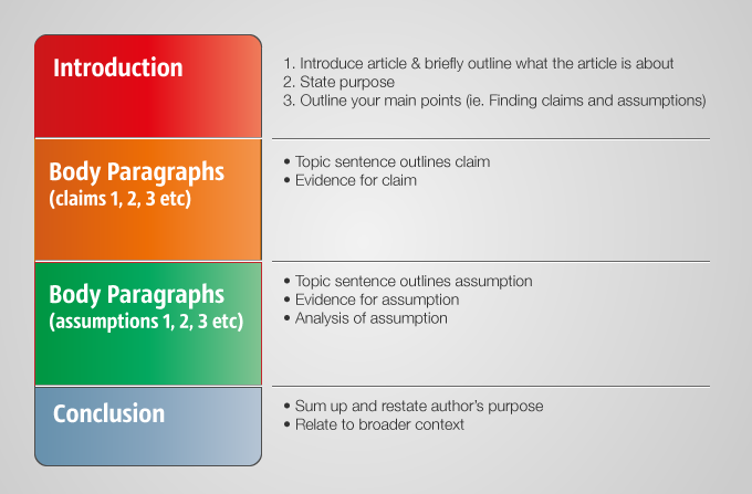
- Paragraphs. Be sure to divide text into paragraphs, since they make the text structured and readable. Many bloggers make paragraphs in the text editor, but the publication still turns conjoint. The reason for this is absence of space option between the <p> </ p> in blog template styles.
- Text styles and colors. Text transmits blogger thoughts, so don’t use it as an element of design, often changing its color and size. Try to stick to one style of text formatting in all posts. The color can distinguish a few words or a title, but not the whole paragraphs. Font styles and should not be changed as well, because it complicates reading.
 Numbered or marked lists are useful when listing, bold and italics – when highlighting of certain words or text parts. Applying underscore, remember that it may be mistakenly considered as a link and clicked on.
 - Headlines. Among things, mentioned above, headers allow users to navigate through the text.
- Diagrams. Use histograms, graphics, pie/area/scatter/stock/surface/ring/bubble/radar charts to enliven your content.
- Separate posts. Publish not more than 20-30% of the whole article or the page – force visitors to click on a link like “read more”. This design allows you not to clutter the main page and gives reader an opportunity to quickly browse through the posts on the homepage.
- “Chips”. Bring something special into your design (for example, photos, videos, special font styles, etc.) and your blog layout will look like a glossy magazine – stylish, beautiful and expensive.
Optimal frequency of posting and post size

- Frequency. Present material regularly; the maximum output frequency of new posts should not exceed two weeks. This period is often associated with weekly shows and programs, and if you write less, it’s perceived as a frivolous approach. The minimum frequency of the output normally doesn’t play a great role. But a blogger has taken a high rate, he must uphold it. Take a rule to publish articles at regular intervals, for example 2 or 3 times a week. Thus, the audience will get used to blog on certain days, and attention will grow. If you create articles or other content chaotic, distribute publication at regular intervals (e.g., set aside time for writing content for your blog).
- Post size. The volume mainly depends on the blog subject and audience. Try to be laconic for technical audience; for humanitarian – add some life stories. The average article size is around 2500 characters. If an article gets too large, divide it into several parts. The minimum size is 1000 characters. Lesser volume is used for announcements, or just in case of bad-quality content.
Conclusion or author’s image as the main blogger’s chip
The main component of a good blog that makes it unique and exclusive is the author’s image. Being ordinary or similar to someone, you’ll never succeed, as “someone” created his blog earlier. Present yourself as a bright personality with own point of view and particular vision of a topic. If you have some special talents or just a hobby, show it design or posts to make your blog unique.